Besides the female-positive cast, the book was... good, usually solid fun, edging towards great, but never quite reaching it, to be honest. I would have preferred a little more character and a little less nonstop action, although I can certainly see how the virtue of the superhero comic is generally that it does it the other way around. But what was great was the covers of the series, drawn by Mark Brooks. Especially towards the end of the run, they were pretty amazing deconstructions of gender and power in various media forms, a perfect purified version of what the series was aspiring to. But I haven't seen anywhere where all of the covers are collected, so I thought I might as well do the honors. In order then, without further ado, I present the covers of Fearless Defenders.
Issue #1
So far, so generic, though it's nice that each hero is facing the other's regular villain type.
Scottie Young drawn variant cover, which is roughly the same action, but everyone is adorable.
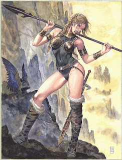
Manara variant, which goes for a pin-up cover-type approach--
A little too much cheesecake, I think.
Deodato variant. ...My, that's a big gun.
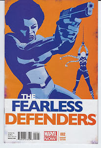
Issue #2
Here's where things start to get interesting. It's a very simple idea for a cover, but it works really well. And it starts a transmedia theme that's going to come up a lot.
Martin's variant cover. I like the way the blue and orange juxtapose.
Issue #3
Back tattoo title. Nice way of establishing Hippolyta's style, and putting her at odds with the existing team.
Jiminez variant. I believe this makes the Wonder Woman analog fairly obvious.
Fearless Defenders #4
This one got a lot of attention when it came out. It has the paper doll play aspect, which is generally a feminized activity, but by virtue of being a comic book cover, and featuring a comic book character, it also says something about how comic book creators and fans "dress up" their (female) characters.
Fearless Defenders AU #4
I'm not sure this one counts, to be honest, as it it's a Jiminez cover and was part of the tie-in to the Age of Ultron series, not this series proper. But I do like the way Wolverine, Hulk, and Captain America look sort of dumbfounded at Hippolyta's beheading.
Fearless Defenders #5
Cover as Street Fighter-esque fighting game, illustrating another way that we play with our superheroes. And illustrating the roster of characters that were felt to fall under the title's mandate, though not all of them ever appeared in its pages proper.
Amanda Conner variant. It's a little more generic (the team pose) but it also shows the variety of Defenders the book could potentially feature.
This, on the other hand, shows no members of the series at all, in order to participate in the "Wolverine Through the Ages" cover series, a bunch of alternative covers that have nothing to do with the comics, but do feature Wolverine from various points in Marvel past, present, and future. Well done, Marvel. You have taken your all-female comic, removed the title characters, and replaced them with your best-selling male character. Very on the nose.
Fearless Defenders #6
Recasting the superhero cover in the genre of the 50s horror comic. Undead Norse vikings lend themselves well to that sort of thing.
Fearless Defenders #7
I think there's a reversal of the manual labor = men stereotype, though we've also got the medium-displacement joke (comic book cover as billboard) and the displacement of labor (superheroes in costumes wearing uniforms for manual labor).
Fearless Defenders #8
Cover as sketchpad, and one that's definitely emphasizing the female form. The pencils are eraser are a nice touch.
Fearless Defenders #9
Another example of re-appropriating a genre that's highly charged when it comes to female depictions: manga. The bottom has Dani Moonstar saying "Okay, now we're just pandering," in part to show the reader, yes, we realize what we're doing here.
Fearless Defenders 10
Another media appropriation, this time the hip-hop album cover. Makes a nice introduction to the new character too.
Fearless Defenders 11
Soviet-esque poster. Kind of surprised that they didn't put Natasha in the front here, although any chance that avoids stereotyping a character who is already "Russian spy" is probably a good idea.
Fearless Defenders 12
And here we have the end of the line, as the train pulls into the cancellation station. This is probably best of the bunch: a pastiche of the romance novel covers, and maybe the only one that can credibly claim to be inverting heteronormative tropes as well as gender tropes. I also like that it's Riggs that's holding Valkyrie, as it demonstrates how their roles in relation to each other have changed over the course of the series.
So... what have we learned? Well, variant covers aren't all they're cracked up to be; with all due respect to the artists' skills, most of them fail to hit the same height as the original. And that's no surprise; you've got a regular person who's connected to the entire series, compared to someone who's just in to do a single issue, then the regular artist should be able to connect better to the series' theme; otherwise, they probably shouldn't be the regular artist. Moreover, we've got a pretty powerful case that the comic book cover can and should be used better than it is. The covers here generally don't connect to the events of the book, but they do illustrate the characters we should be paying attention to, and do a great job of presenting visually the themes that the book wants to claim as its own. That's so much more than a generic pose or random action shot that the typical cover conveys. And it really explores what the cover is allowed to do, as a type and medium. I don't think I've ever become a fan of an artist before just for their cover designs, but I will look out for whatever Mark Brooks does next.


No comments:
Post a Comment