The answer which may surprise you below. Warning: surprise not guaranteed.
This, incidentally, is the sort of idle thing I do on a late morning Saturday afternoon in which I don't feel like going outside. Here's what I propose: I'm googling "best fantasy cover" and then taking the results from google images and checking out their Goodreads score to see if a high placing on the Google ranking corresponds to a high average rating on Goodreads. Like any good study, there's a number of caveats that limit the value of this experiment to almost useless:
--Goodreads is not necessarily a perfect determiner of book quality.
--many fantasy books have multiple covers, and there's no guarantee that Goodread users are investing any effort to make sure that the edition they rate is the one they read.
--I don't really remember what correlation means from my undergrad Stat class, and I'm way too lazy to look it up.
Anecdotally, I'd say there isn't a connection, but that's just based on me not immediately identifying any of the books that pop up.
So here we go.
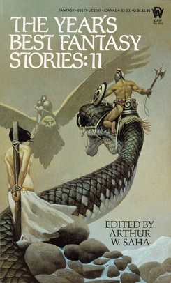
1)
The Year's Best Fantasy Stories: 11, edited by Arthur W. Saha. It's a good cover, in that it conveys action is about to happen--it feels like a snapshot of a world, rather than just "here's a title" or "some random elements that look vaguely related to the title" approach a lot of covers do. And I like the idea of a giant animal rumble. Sort of like a Howard-esque Pokemon. By Crom, I choose you, giant snake! On the other hand, it seems a little cliched to go the damsel in distress route. It's a 1985 edition, the contributors I recognize are Tanith Lee, Jane Yolen, and Gene Wolfe, and it's got 8 ratings on good read, with a 3.12 average rating, which means we've failed the hypothesis rgith out of the gate. Not only is it a fairly mid rating (at best--although that brings up another question. What's Goodreads' average score, overall?), it's barely been reviewed in recent years. I imagine that's pretty common for older "Year's Best" anthologies.
2)
Canticle by Ken Scholes. Scholes' name is vaguely familiar. But I can't say I've heard of this book. It's certainly less action-oriented than the last cover, but at least it's implying that something of import or at least interest is happening. There seems to be more figures in the background, belonging to the party on the right, I'm guessing. I like the branch in the extreme foreground, that's in front of the pair on the right. The slightly obscured view suggests that the reader is peering in on the scene as an observer. This book is 2009, as book 2 in the Psalms of Isaak, and its received 855 ratings, with an average of 3.96. Further, it's got 94 reviews--generally speaking, a high review number means that the book meant something to people, that they felt compelled to do more than just click a star rating. That's a reasonably high score and a decent level of exposure. That's high enough that I'm going to add the first book in the series to my To Read list.
Incidentally, since I never read another fantasy classic, A Canticle for Leibowitz,I don't actually know what a canticle is. My guess would be a combination of manacle and incantation; google tells me it's a hymn, usually associated with a biblical text. Which is practically the same thing, right?
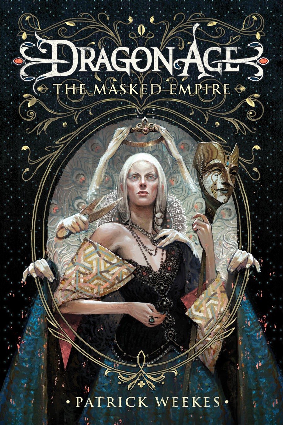
3)
Dragon Age: The Masked Empire by Patrick Weekes. Typically, I'm not much for videogame novel tie-ins. It's not a terrible idea, as fantasy worlds featured in RPGs generally have more stuff set up for them than can actually be expressed in the game. But so much of videogames like Dragon Age are predicated around player choice and the centrality of the player that the story in other media becomes weird to me. On the other hand, I've heard good things about the Dragon Age books. And the other book I've read by Weekes, his own original series The Palace Job was a simply excellent genre hybrid of fantasy and the caper thriller plot. Moreover, this is the first cover that appeals to me for more than presenting a cool scene that looks like it's been taken from the story. I like the frame, which, combined with the woman's posture, makes it look like she's peering into a mirror; I like the disembodied hands, grooming her. I like her mask, which is kind of creepy. And I like that it presents a haunting and beautiful woman without indulging in ridiculous T&A, always a hazard in fantasy novels. Here, the average score is 3.91, with 276 ratings and 31 reviews. Further breakdowns (I just realized realized you could this--if I was more industrious, I'd go back over the other two) has this edition in particular at 3.94 and 387 ratings. I'm not really sure how there can be more ratings for this edition in particular than all editions, though, so that stat sounds suspect. At any rate, while it's not a widely known book, that is pretty good numbers. I'm a little hesitant to add it to my to read list, though, as it's the fourth book in the DA book series.
4)
The Unremembered by Peter Orullian. If this was an award show, this cover would be one of the nominees I'd clap for politely, but not enthusiastically. It's fine, and the birds give a nice sense of motion. But it feels kind of generic to me--very much "ranger in the woods." It'd be nice to get more of a sense of what the book's about. I suppose it could be about rangers walking through wilderness. It's got an average of 3.35, over 701 ratings, with 139 reviews. That's not bad. It's also one of those massive fantasy tomes, at 672 pages. The plot, incidentally, is high fantasy all the way: an ancient evil awakens, and a young man in a remote area of the world with an amnesiac past is compelled to join some strange people on a long journey. Still clapping politely, here.
5)
Jinx by Sage Blackwood. I like this cover a lot too. Even without the young boy, you could fairly predict it's a children's novel, just because it's more stylized--it's not a set in stone rule, but adult fantasy tends to adopt a realist sort of imagery, whereas this is clearly more abstract--I'd say cartoonish, if it wasn't for the word's negative connotations in terms of being "just for kids." Anyway, I like the way the way the vines encroach on the book's title, and the the way the path converges back to the somewhat forbodding house. (Castle?) The branches on the right and left that resemble hands are also a nice touch. The book is fairly popular: 4.00 rating, 1469 ratings, 262 reviews. That's the highest rating yet. I'm adding it to the to-read list, though it takes a lot for Children's fantasy to rise above the norm for me. (Incidentally, I'm edging towards more books on the to-read list than books I've read. I'll probably do some paring/heavy reading at that point.)
6)
Second Sight by Greg Hamerton. It's a cool title, definitely. And if the book features the number 8 or infinity prominently, then it's thematically a good choice too. But at the end of the day, there's not enough going on here for my tastes. In general, I'm not a fan of the title only cover, and this is too far in that direction for me. It sits at 3.86, 123 ratings, 24 reviews, which is a small audience, but respectable. And another long one, at over 600 pages. It's a fantasy series where the magic is based on music, which can be a good premise, notably with a female protagonist.
7)
The Riddler's Gift by Greg Hamerton. Two Hamertons in a row? Shenanigans. There's some google stacking here. Again, it's not really something I personally find appealing. It's a good vista, and a nice expansive mountain scene, but I'd prefer something that speaks more to the uniqueness of the fantasy world here. I can't find this edition on Goodreads, but another (depicting a character from the series who looks kind of like a thinner version of Mason Savoy from Chew) is 3.86, 302 ratings, 56 reviews.
8)
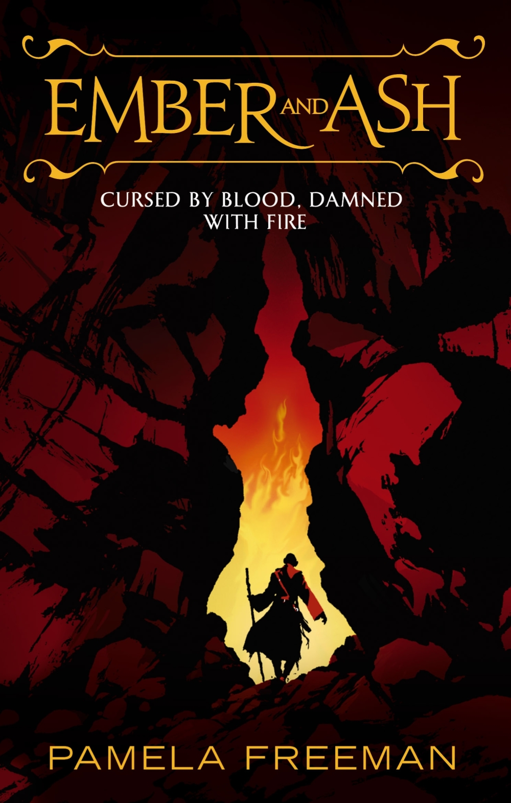
Ember and Ash by Pamela Freeman. Technically, this has a lot in common with The Unremembered: a character, presumably the protagonist, faces away from the reader, in the context of some sort of nature scene. But the nature of that nature is very different here. There's a sense of foreboding, with the fire in the distance, and the narrow fissure between the rocks.The character's silhouette, nearly all dark except for a splash of red, is striking. And look--the cover features a fire, and the title features a fire. See how that related thing works? The plot description features a girl named Ember who is supposed to unite two people long at war, until her fiance is murdered (or, as the info blurb says "her future goes up in flames," which is perhaps taking a theme too far) and she teams up with Ash, son of a seer, to find an end to the conflict. It's definitely on the longer side, with 528 pages, published in 2011, and it's got an average rating of 3.54, 158 ratings, and 40 reviews. I can't say it grabs me--a little too straightforward for my tastes, if the summary's accurate, and a little low on the popularity scale. But the cover's nice.
9)
The Winds of Dune by Brian Herbert and Kevin J. Anderson. I'm conflicted on this one. First, it's not really a fantasy book, Google. Get your story straight. It's space opera using sci-fi as a setting for sword and sorcery fantasies, which is totally different. I'm also not crazy about Dune as a series; I've tried reading it once or twice, but it didn't grab me. But I have to give Anderson credit for being a solid space opera genre writer, both for his Star Wars books and for his Saga of Seven Suns series, which I devoured once, years ago. (I remember how he made of point of mentioning in the foreword for one of them that the entire series is longer than War and Peace.) As for the cover: it gets points for depicting a landscape actually relevant to the content, the desert world of Dune. And the wind in the distance and the moon are really nice. The character faces away from the viewer seems to be a trope that comes up a lot in these covers--maybe so the reader can envision the character as she sees fit. It's an interesting contrast with videogame covers, which tend to feature their protagonist prominently, even in games where you can modify the protagonist's appearance. I imagine that's because most games have you seeing the character, which makes the visible part more significant. The cover's edging towards cheesecake with its focus on the character's ass, but I'll admit I've seen a lot worse. It's published in 2009, it's 448 pages, and it gets a 3.77 rating, with 4748 ratings in all and 114 reviews, which I think makes it the most rated yet, though not the best rated by any means.
10)
The Far Kingdoms: A Mythic Tale by Allan Cole and Chris Brunch. If you're going to do the landscape-type cover, this is what I'd like to see. At least you get a sense of the fantasy world here, how it's fundamentally different from our own. The mist and mountains contribute to a sense of "farness" in what's presumably one of the far kingdoms, as does the presence of ships. The blurb is kind of interesting--it's very brief, but basically says its main character is a pampered merchant boy sent out to earn his keep as the rest of his family did. Even though that's next to nothing information-wise, I like the idea of a fantasy series that's got an unlikeable protagonist that isn't out to save the world. It's harder to sell, I imagine, given the lack of stakes, but I appreciate the novelty. On the to-read list, then. It's got an average of 3.67, 261 ratings, and 16 reviews. This addition isn't widely added, but it tends to rate a little higher, at 3.83.
So what can we conclude? Um. Not much. It doesn't look like there's any direct connection between fantasy book covers and their reception. But some general patterns are emerging. I kind of liked this as an exercise in armchair criticism; I think I'll do it again some time.
So what can we conclude? Um. Not much. It doesn't look like there's any direct connection between fantasy book covers and their reception. But some general patterns are emerging. I kind of liked this as an exercise in armchair criticism; I think I'll do it again some time.
What about you? Are there any fantasy book covers that have stuck in your mind?
Later Days.
Later Days.


No comments:
Post a Comment